Anheuser-Busch
Brand Identity
Refreshing the identity of America’s largest brewer to help forge their future while honoring their heritage.
Overview
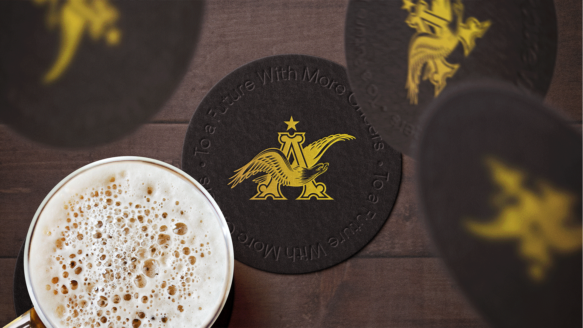
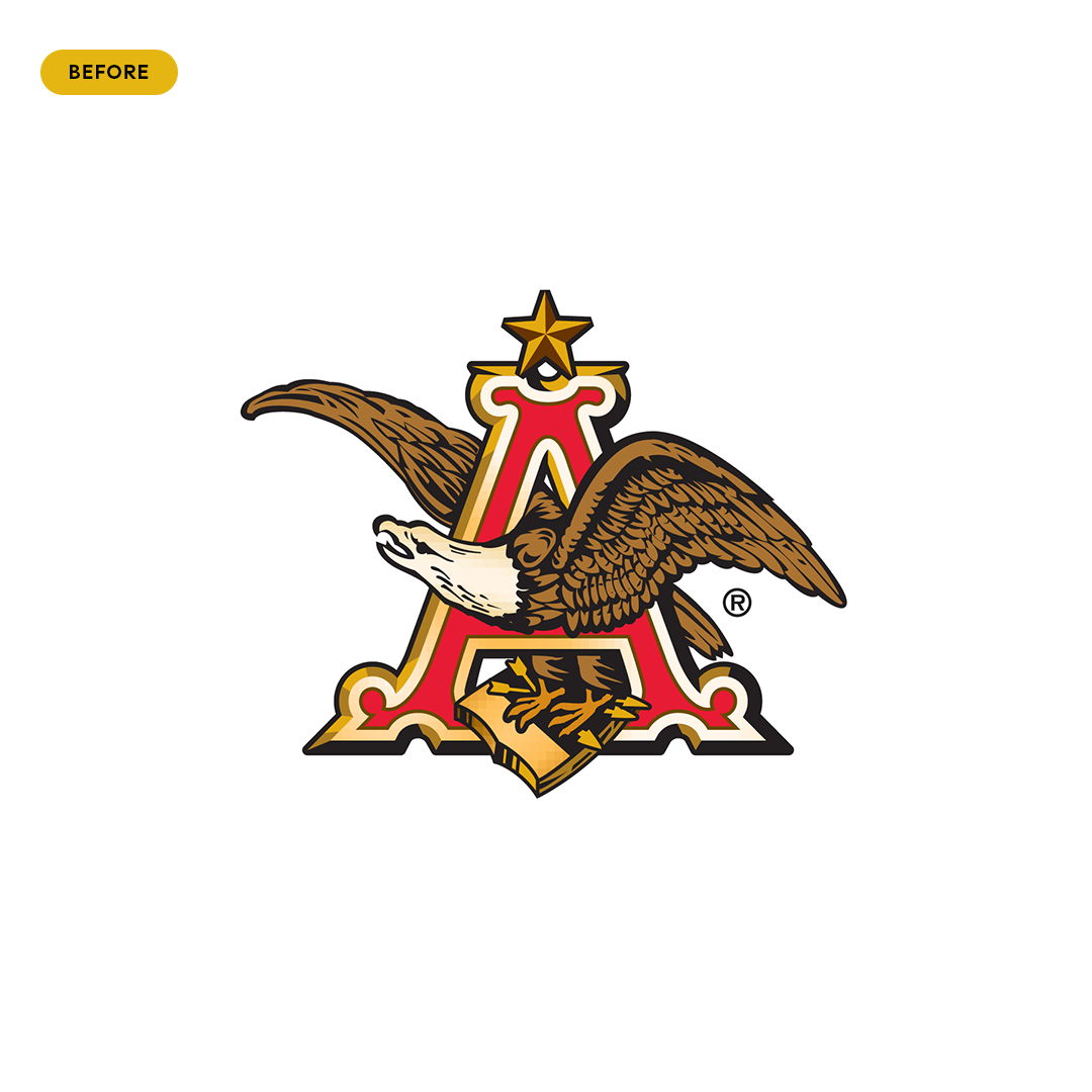
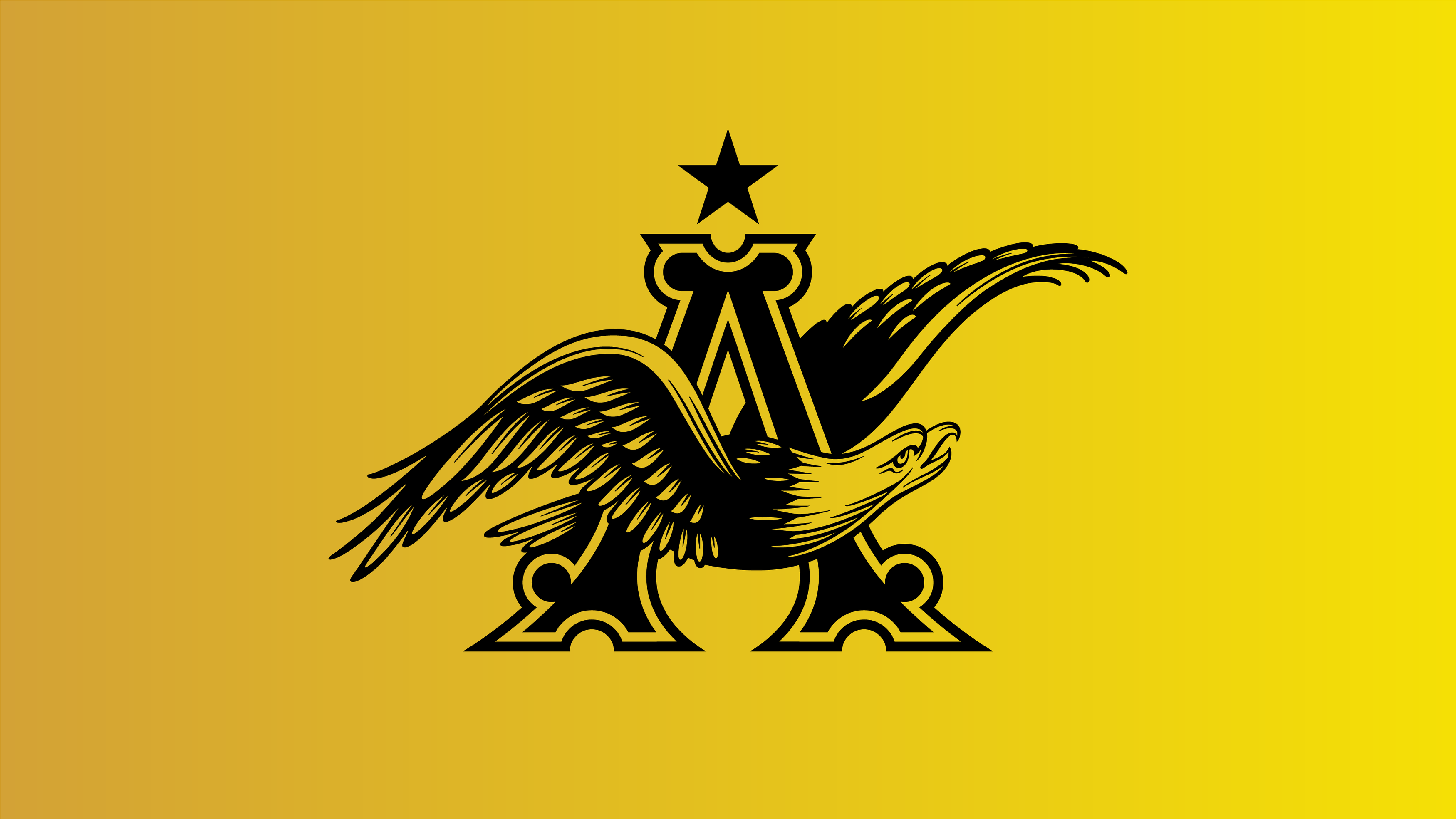
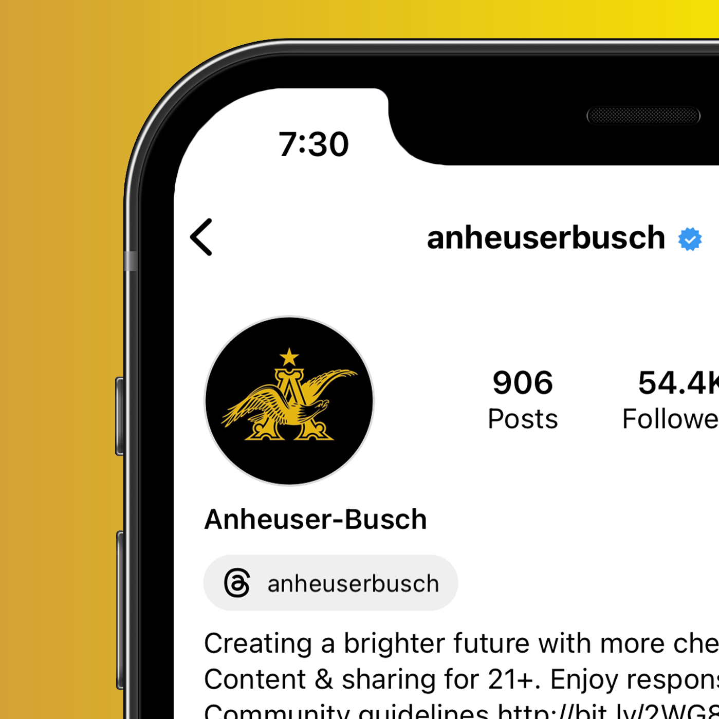
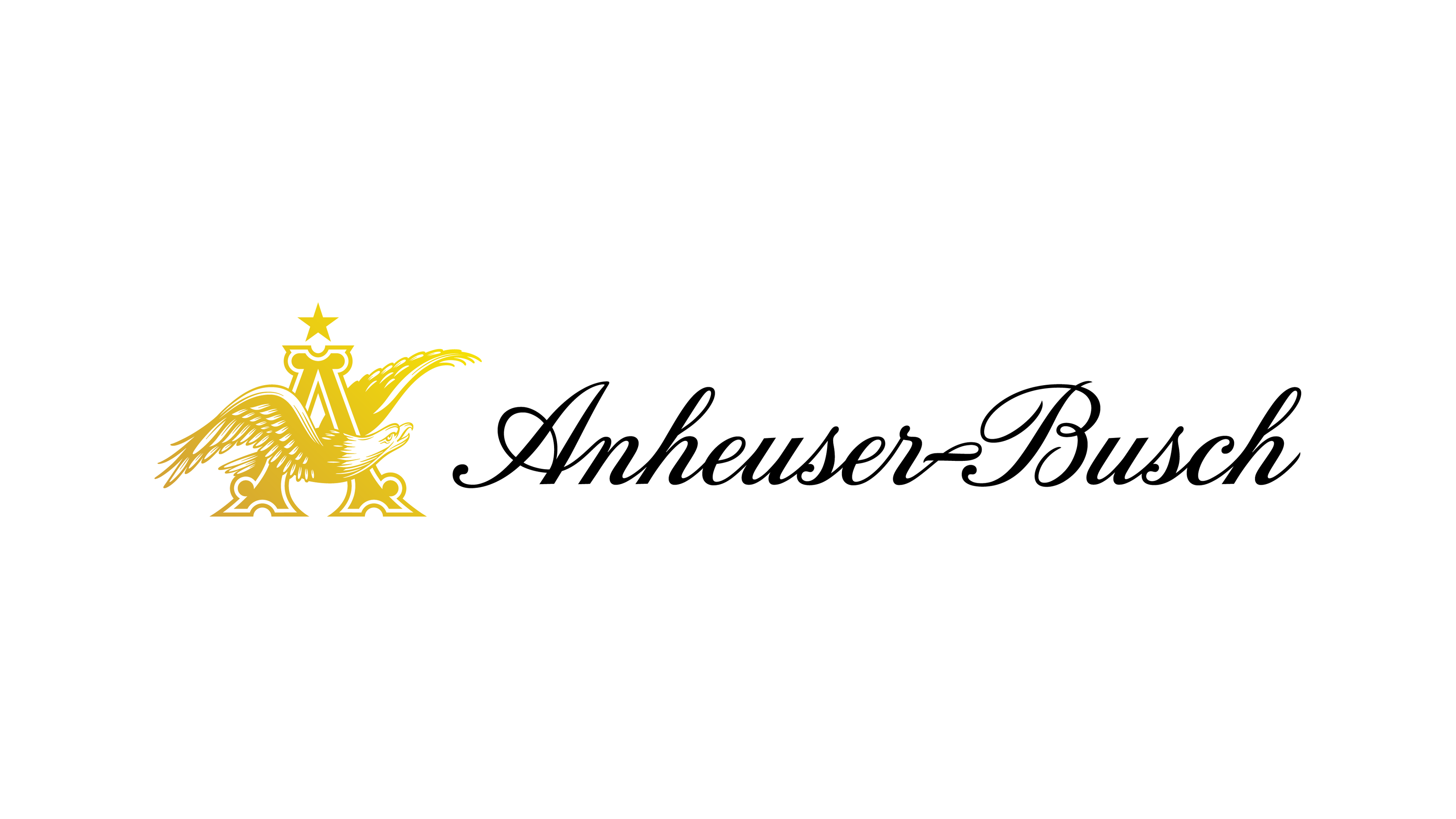
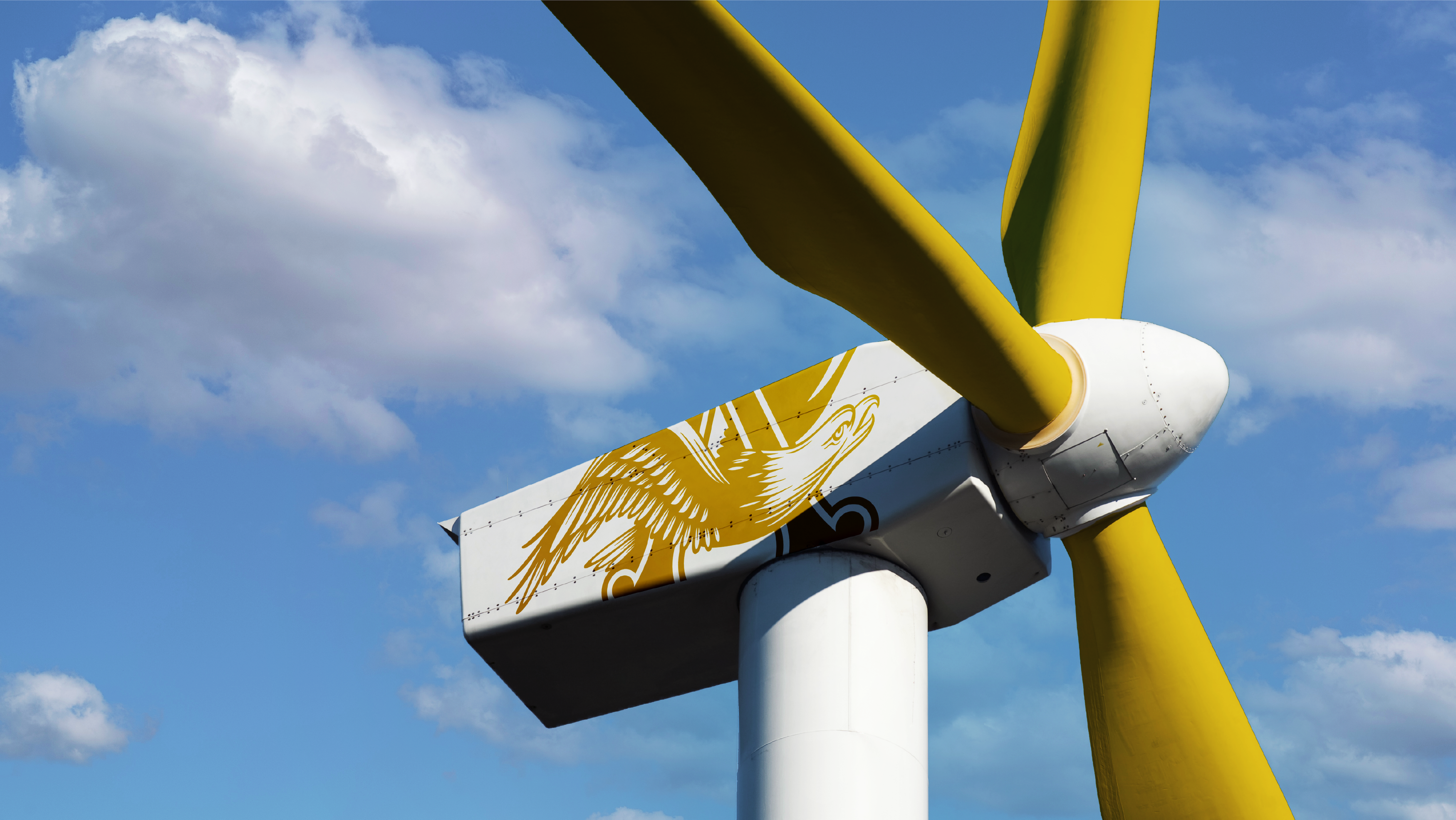
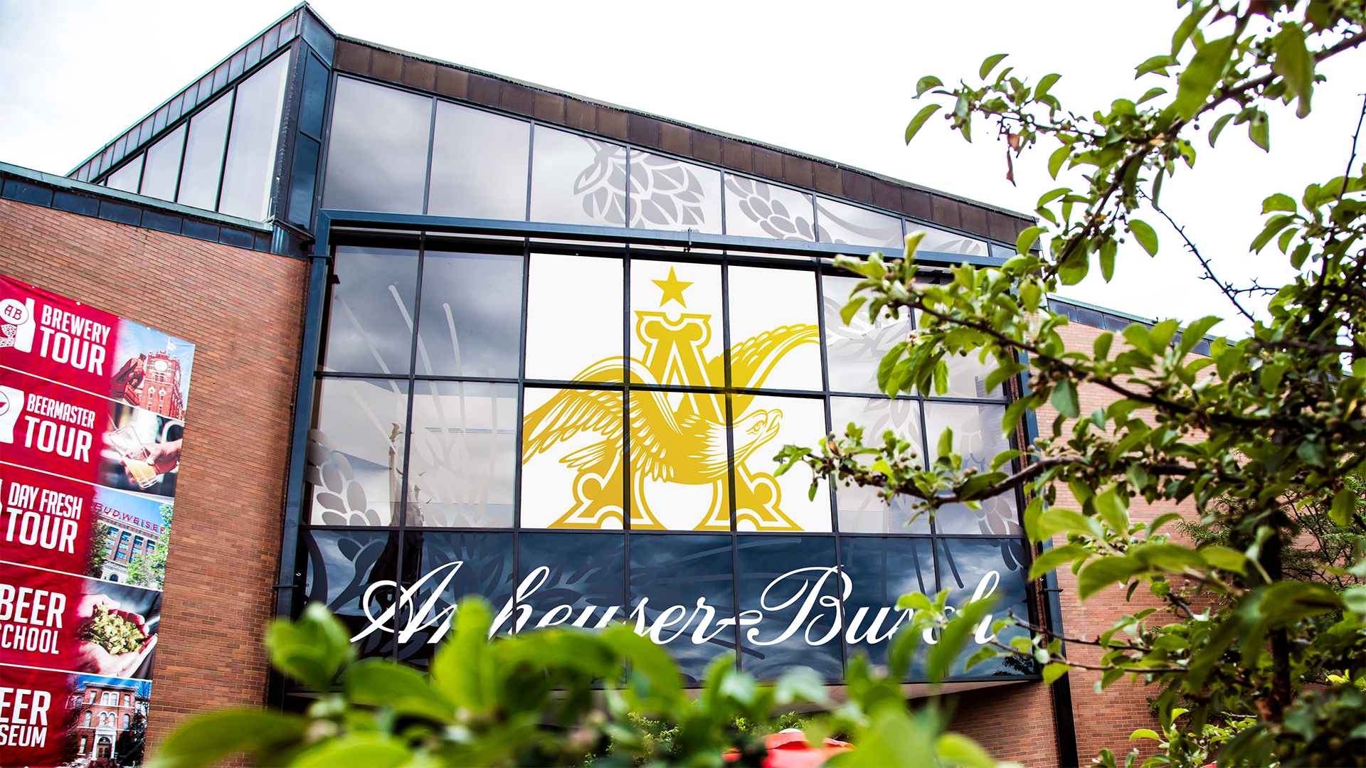
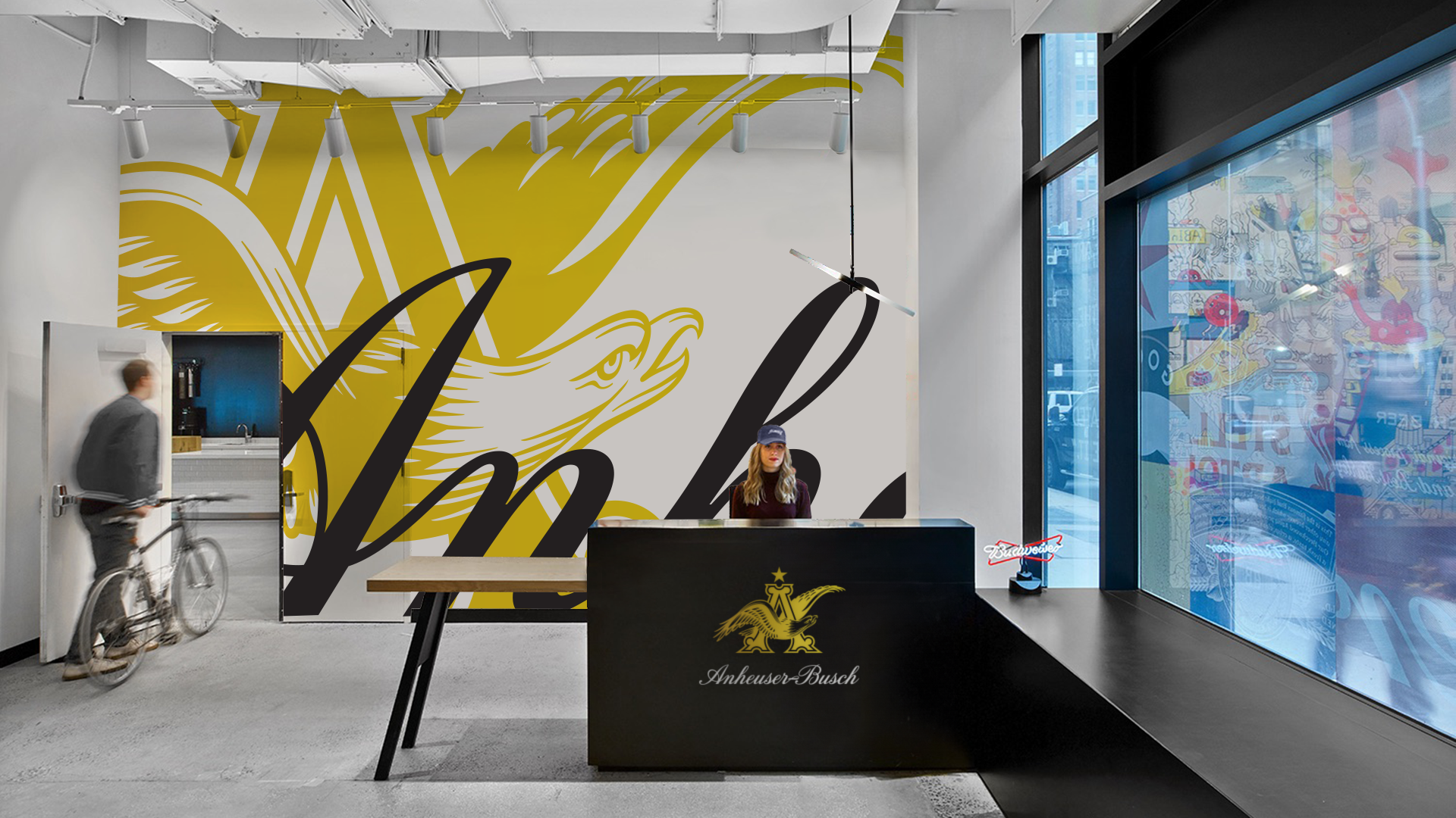
As America’s largest and well-known brewer, Anheuser-Busch sought to evolve its visual identity to better align with its new values and aspirations as a company. The refresh sought to preserve and celebrate its rich heritage by restoring and optimizing the company's renowned brand components such as its wordmark and iconic 'A&Eagle' symbol.

Solution
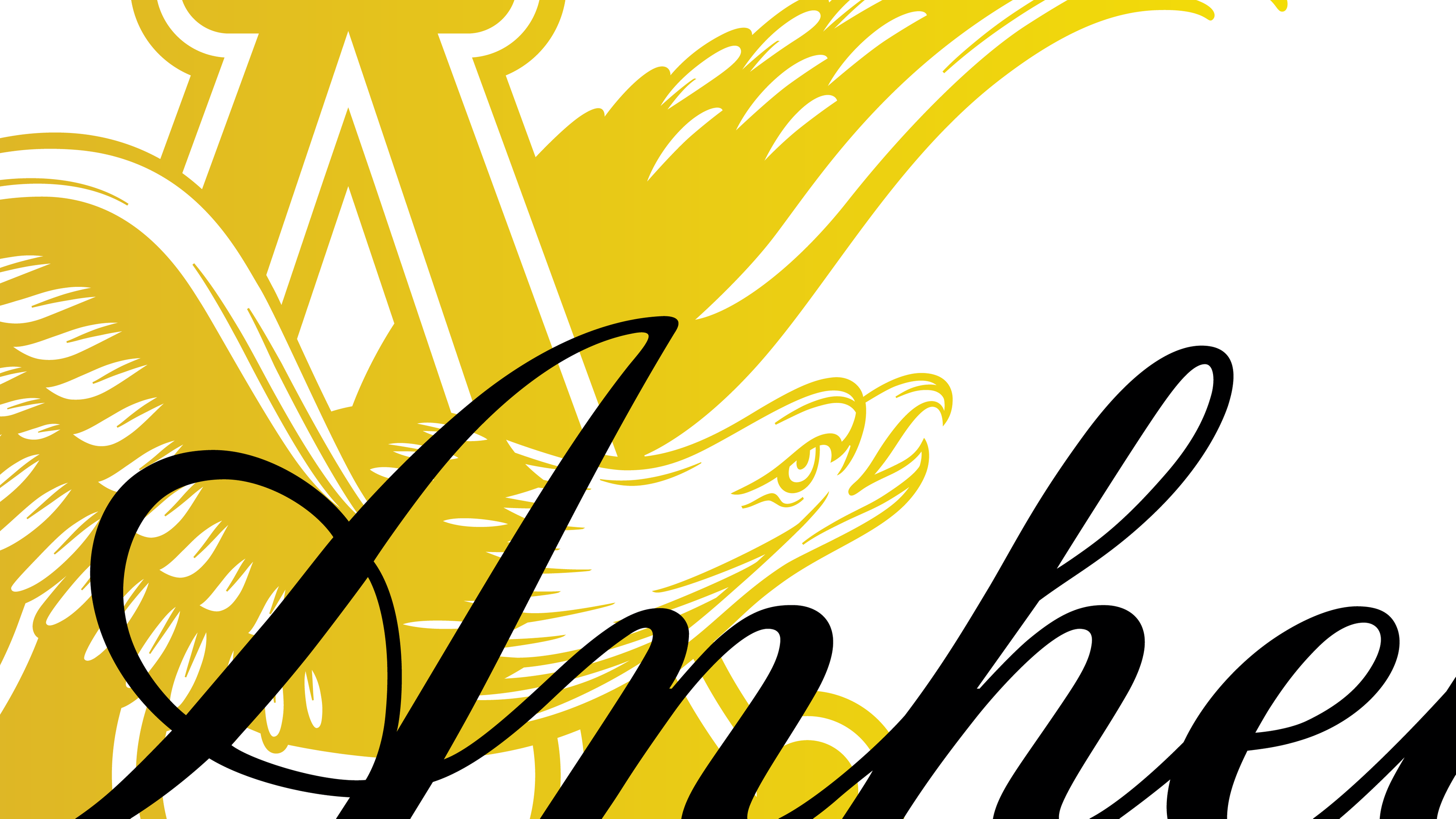
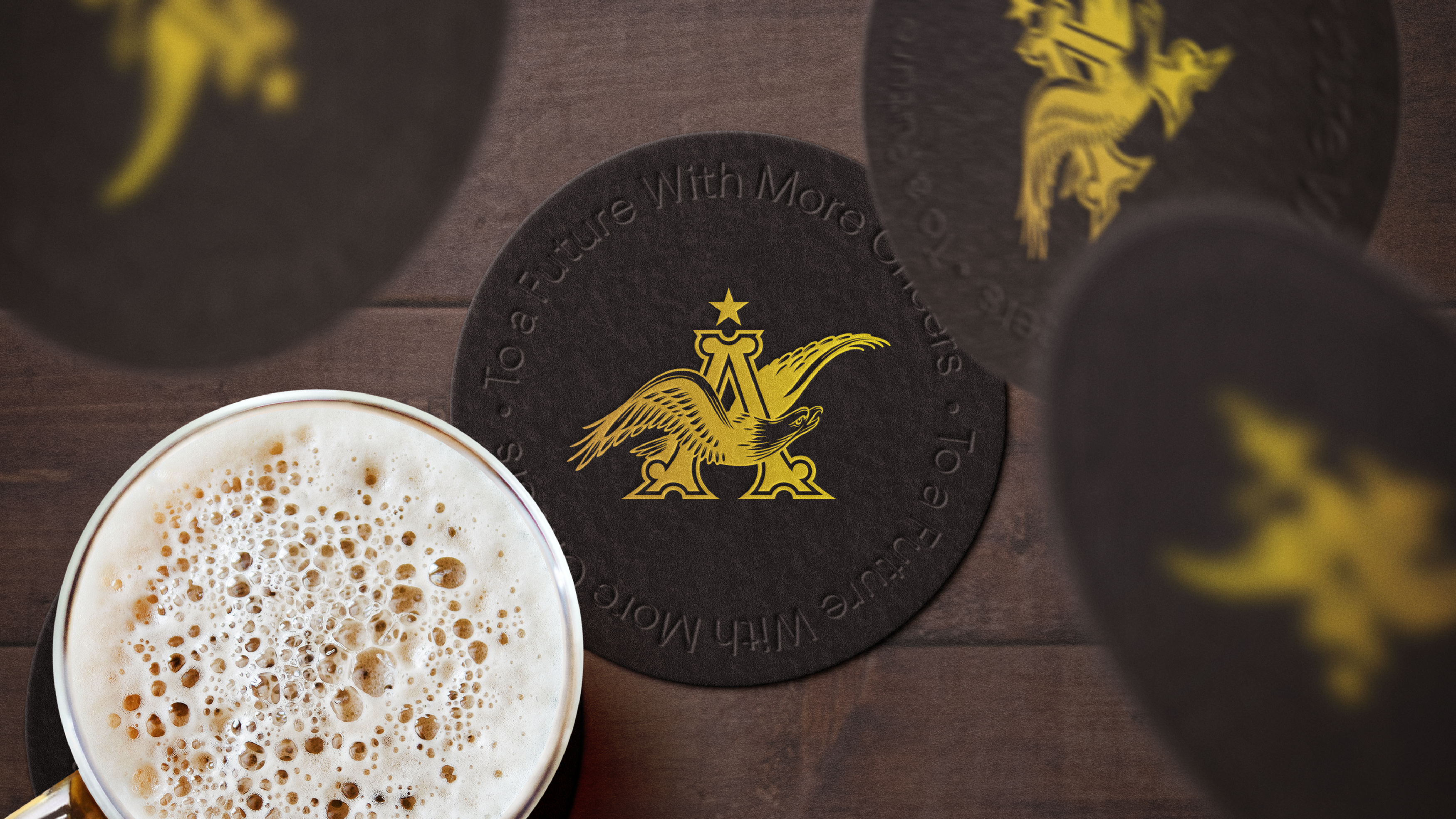
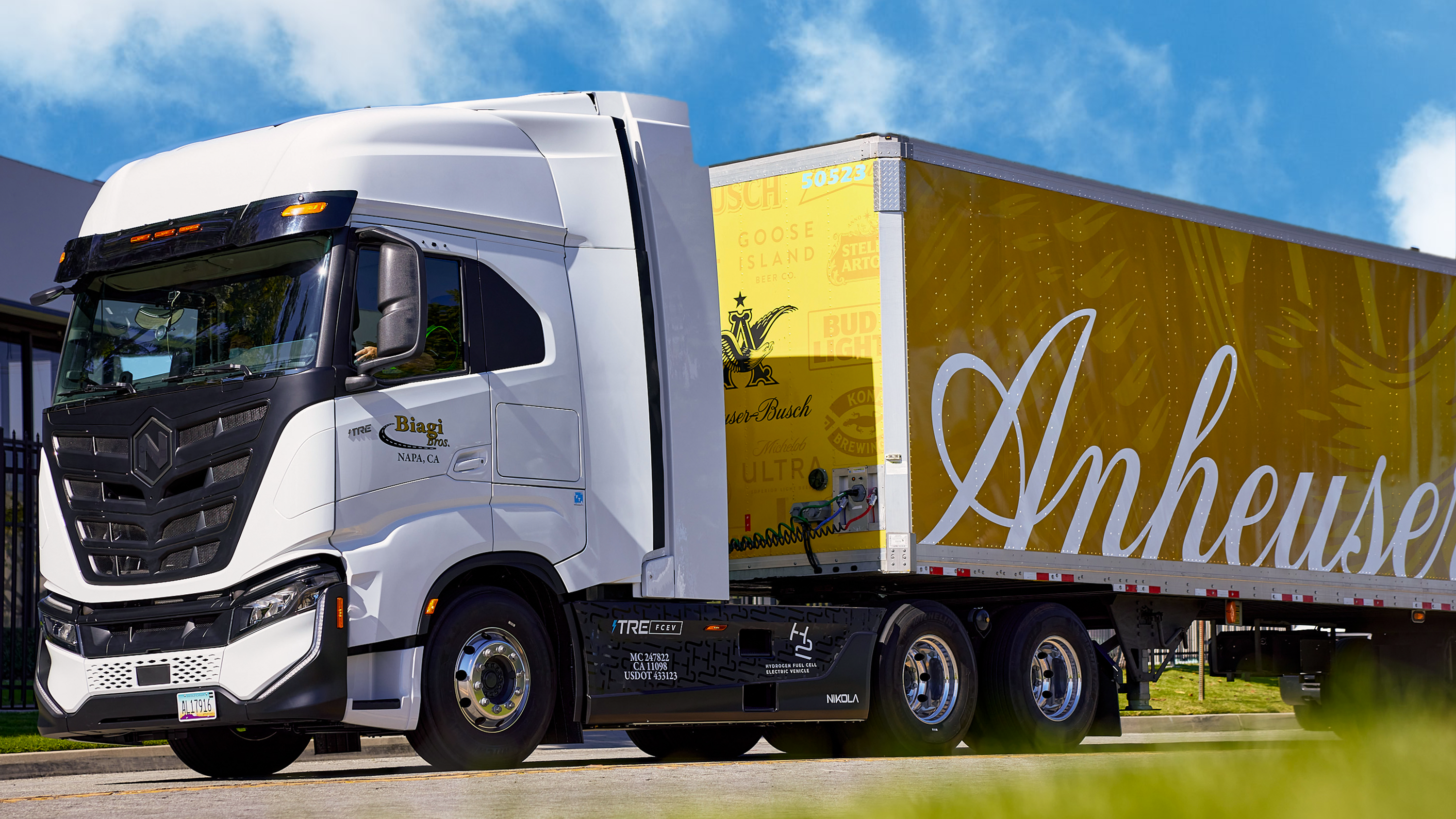
The iconic “A&Eagle” symbol was redrawn to showcase the craft and character that was once embodied in past iterations. In addition, modern enhancements were made to optimize the symbol for the modern landscape— allowing it to be scalable from large and small, physical and digital applications.


Completed at Prophet
Design
Michael Ponton
Mike Preston
Craig Stout
Peter Dixon
Illustration
Peter Horridge
Motion
Craig Oelrich
Stretegy
Michael Miller
Project Management
Ashley Strang
Josh Carlton
More Work
Thanks for visiting!
Interested in working together?
Shoot me an email.
hi.mponton@gmail.com
© Michael Ponton 2023—New York
© Michael Ponton 2023—New York